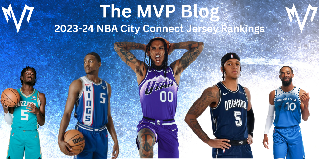
The inaugural NBA in-season tournament is in full swing. Teams are vying for the coveted (?) trophy and $500,000 per player. As part of the promo material for the in-season tournament, NBA fans have been treated to another installment of the league’s “City Edition” campaign, complete with hideous new courts and flashy new jerseys that range from elite to vomit-inducing. In today’s blog, we will be ranking every single city connect jersey for the 2023-24 season from worst to best.
Joining the MVP Blog today as a special guest is Owen Goldfarb.
If you are enjoying the content, please make sure to subscribe to The MVP Blog and follow us on Twitter and Instagram.
30. Miami Heat (Average Rank: 27.0)

Owen: What was the goal of putting the word “culture” on the jersey in a font twice as large as the team’s actual name?
Ben: Somebody point me in the direction of the handsomely paid graphic designer in charge of this new jersey so I can fire them out of a cannon.
Ryan: Culture is the most overused word in sports. I hate putting that word on a jersey.
T-28. Memphis Grizzlies (Average Rank: 26.7)

Owen: The font is barely legible, why not just write the letters?
Ben: Why is the font so small? There’s so much negative space. All in all, it looks like this thing was designed on CustomInk.
Ryan: When I first looked at all the city connect jerseys, it took me a few looks to figure out whose jerseys these were.
T-28. Denver Nuggets (Average Rank: 26.7)

Owen: We get it, the mile high city, 5280, just go back to the Mutombo days, will ya?
Ben: THAT’S WAY TOO MANY NUMBERS FOR ME. YOU LOST ME. I AM NOT A MATH GUY!
Ryan: These are so bland. I like incorporating the 5280 into the jersey, but it being bigger than the player’s number makes no sense.
27. Brooklyn Nets (Average Rank: 26.3)

Owen: Not much to be said here. It looks like they threw paint at a jersey and called it a day.
Ben: “Nobody knows what it means, but it’s provocative”.
Ryan: These look like somebody vomited on them. I wouldn’t be caught dead rocking this jersey.
26. Washington Wizards (Average Rank: 26.0)

Owen: I don’t hate saying District of Columbia, but the colors don’t make sense, nor do they go together.
Ben: Those thin diagonal lines that criss-cross immediately caught my attention in the worst possible way.
Ryan: If they just stuck with the black for the entire jersey, these would be super clean, but the cut off of grey ruins them.
25. Indiana Pacers (Average Rank: 23.7)

Owen: I don’t know where the light blue came from – aren’t they navy and yellow?
Ben: Shades of the Dallas Mavericks’ City Edition unis in 2019/20, and that’s not a compliment.
Ryan: I just don’t think this colorway works at all.
24. Los Angeles Lakers (Average Rank: 22.3)

Owen: I’m not sure what the goal of the triangular text was here, and the N in Angeles is way too high.
Ben: Can we stop designing nontraditional uniforms for the teams with the most classic and iconic threads?
Ryan: The triangular text pattern is TERRIBLE.
23. Golden State Warriors (Average Rank: 22.0)

Owen: It feels like they should just be the San Francisco Warriors at this point.
Ben: I’m already so sick and tired of the Warriors using the bland black-and-yellow color palette for their alternate unis. That’s Pittsburgh’s thing. Get your own thing.
Ryan: I’m not a huge fan of the jerseys saying San Francisco, and I am certainly not a fan of the wavy pattern.
22. Milwaukee Bucks (Average Rank: 21.7)

Owen: This is clearly an underrated jersey. I appreciate the strip of tan underneath the Milwaukee on top of the nice blue.
Ben: The shorts are easily the worst part of this monstrosity. Two different designs at once, neither of them working.
Ryan: These look more like a practice pinnie than an NBA jersey.
21. Cleveland Cavaliers (Average Rank: 21.0)

Owen: Really? The land? Who calls Cleveland the land?
Ben: I’m glad they enlisted the help of Evan Mobley to ensure a complete steal of USC’s look.
Ryan: Everyone calls Cleveland the Land, Owen… I like everything about this jersey except for the neck and sleeve trim.
T-18. Toronto Raptors (Average Rank: 18.3)

Owen: It’s a basic jersey. I like the gold main with black borders and sides.
Ben: Is it just me, or are the Raptors leaning too hard into the Drake/OVO thing with their unis? Bring back the purple, red, and black with the dinosaur logo and I’ll be happy.
Ryan: I don’t like this shade of gold, and I don’t like the pattern going down the jersey.
T-18. New York Knicks (Average Rank: 18.3)

Owen: I don’t mind the effect on the New York font, but all the colors feel a bit much.
Ben: I love the subtle black stripes (a nice nod to the Knicks unis of the 2000’s) but the weird shadow effect on the font loses me a little.
Ryan: I’m just not a fan of the shadowed font.
T-18. Atlanta Hawks (Average Rank: 18.3)

Owen: It feels like they went on google and used Times New Roman font.
Ben: I think that these would be a winner if they didn’t completely butcher the font. Sigh.
Ryan: At first glance, I really liked these, but then I noticed that the ATL gets bigger with each letter. I hate that.
17. Philadelphia 76ers (Average Rank: 17.7)

Owen: It’s not terrible – don’t love having the city of brotherly love instead of phila.
Ben: The blue Nike logo bothers me. It could just be an OCD thing, but otherwise, this is solid.
Ryan: Nice and clean. I love the cursive font.
16. Chicago Bulls (Average Rank: 17.3)

Owen: I’m interested by the vertical text. It’s a simple jersey.
Ben: I absolutely hate this. The Chicago Bulls regular unis are a timeless classic. This takes everything about those and strips it away in favor of something more corporate and minimalistic.
Ryan: I’m a fan of the vertical text, but these jerseys need more.
15. Boston Celtics (Average Rank: 17.0)

Owen: It’s not bad, but I would expect more from them.
Ben: I love the font, but that’s about it. The color blocking stinks.
Ryan: These are just so mid.
14. Dallas Mavericks (Average Rank: 15.7)

Owen: It’s goofy font. I don’t know why they love to put Luka in cartoony jerseys.
Ben: Make the font bigger and the numbers white and you have a winner.
Ryan: I’m a fan of the curls on the M and S in Mavs, but I am not a fan of the color they chose for the numbers.
13. New Orleans Pelicans (Average Rank: 13.0)

Owen: I like the flash of green in the number. It feels fitting for the Fall season.
Ben: The volt green is a bit much, and I would’ve liked to see some purple incorporated, but these are pretty cool and definitely eye-catching.
Ryan: These jerseys feel like a perfect representation of the city of New Orleans.
12. Los Angeles Clippers (Average Rank: 12.3)

Owen: First time they’ve ever done something better than the Lakers.
Ben: Can’t take my eyes away from the bottom right of the front of this uniform. Is that a line of clipart basketballs and a flowery Clippers logo?
Ryan: The basketball as the dot for the I is such a nice, subtle touch.
11. Portland Trail Blazers (Average Rank: 11.3)

Owen: It feels like we have seen this the last 5 years.
Ben: I love the red plaid elements. My only complaint is that I want more plaid.
Ryan: These are clean, but I really wish that the Blazers would come up with something new.
T-9. San Antonio Spurs (Average Rank: 10.0)

Owen: I love the simplicity – orange border pulls it together with nice fonts as well.
Ben: This one is a bit of a mess stylistically, but it somehow fits the vibe I get from not only the city of San Antonio but from this Spurs team as well.
Ryan: The curved text with the number right in the middle is a very nice look.
T-9. Oklahoma City Thunder (Average Rank: 10.0)

Owen: I love the use of their great team colors – perfectly fits their young vibe.
Ben: I would’ve done away with the background, but I think that the Thunder finally have a great look for the front of their jerseys with the way the “OKC” font is laid out. Bold, eye-catching, and generally awesome.
Ryan: The colorway is awesome, and I really like the background.
T-7. Phoenix Suns (Average Rank: 8.3)

Owen: I think there is just too much going on.
Ben: It pains me to say it, but the Suns have totally nailed their rebrand over the last few years. That picture of Durant next to the old-school car decked out in matching colors is so great.
Ryan: Of all 30 city connect jerseys, this may just be my favorite colorway.
T-7. Detroit Pistons (Average Rank: 8.3)

Owen: It’s basic. I like the colors on the side mixed with black front.
Ben: The Bad Boys font just can’t be beat. If only the NBA let the Pistons play with chain-link nets when they break out these jerseys.
Ryan: These jerseys just scream DETROIT BASKETBALL!
6. Houston Rockets (Average Rank: 7.3)

Owen: I like the H-town, but it feels like they could have done more with open space.
Ben: The astronaut is kinda tacky, but as long as it stays on the shorts, this uniform is pretty cool. I love the script “H-Town” and the block font for the numbers. Classy, yet modern. Great work!
Ryan: I love the font. I love that it says H-Town. I love the slanted text. I love the simplistic look. Great job, Houston!
T-4. Minnesota Timberwolves (Average Rank: 5.3)

Owen: I love the ombré blue – can imagine Ant dunking on someone in this jersey.
Ben: As far as the experimental backgrounds go in this new set of jerseys, the Wolves are clearly the best of the pack (no pun intended).
Ryan: The fade from white to blue looks so good.
T-4. Charlotte Hornets (Average Rank: 5.3)

Owen: Best thing the Hornets have ever done besides draft Lamelo.
Ben: The Mr. Beast sponsor patch makes me laugh, but everything about this is just so Hornets. Goofy and kinda stupid, but it works.
Ryan: The light blue used for these jerseys is one of my favorite colors of all time.
3. Sacramento Kings (Average Rank: 4.7)

Owen: I love the stripe but not sure the colors are great together.
Ben: Paying tribute to Oscar Robertson’s Cincinnati Royals with a modern twist. Excellent.
Ryan: Ever since the Tyrese Haliburton trade, the Kings can do no wrong. The victory beam is elite marketing, the team is young, exciting, and plays at an electric pace, and these jerseys are brilliant.
2. Orlando Magic (Average Rank: 2.0)

Owen: Shades of the Shaq and Penny days.
Ben: How has it taken this long for the Magic to substitute the “A” in Orlando with a star? Can we make this change permanent?
Ryan: I can’t get over how great the star being used as the A looks. Between that and the color, I’m in love with these.
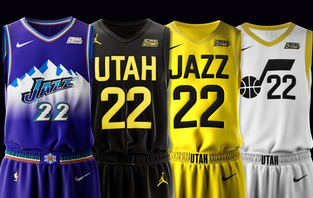
1. Utah Jazz (Average Rank: 1.0)

Owen: Perfect use of color and mountain background.
Ben: The logical next step for the Jazz after releasing this masterpiece of a jersey is to commit to playing in these full-time and scrap their horrendous rebrand from 2022.
Ryan: The mountain background, the colorway, the slanted text… Job well done, Utah.
Which jersey is your favorite? Which jersey is your least favorite?Leave your thoughts in the comments below!
——————————————————————–
Authors: Ryan Macdonald, Ben Pawlak, and Owen Goldfarb
Published: 11/21/23 at 5:40pm EST
